
Subscribe to our Blog
We're committed to your privacy. SayOne uses the information you provide to us to contact you about our relevant content, products, and services. check out our privacy policy.

Generating table of contents...
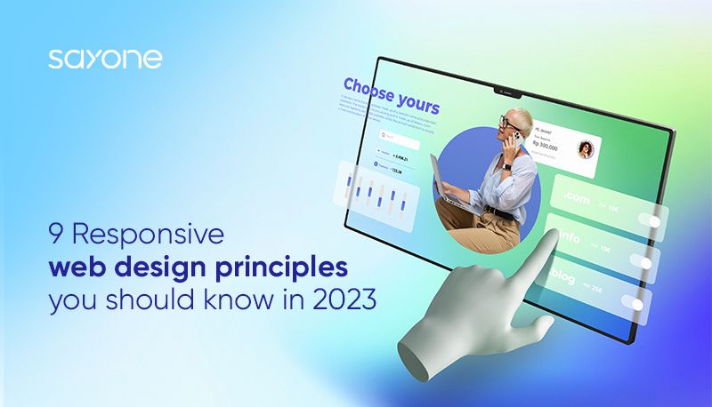
A well-structured, user-friendly, and responsive web design ensures your website looks great and functions well on various devices and web browsers.
We'll be discussing essential principles such as user-centricity, mobile-first design, simplicity, consistency, and various others that play a crucial role in crafting websites that captivate and engage users effectively. These guidelines aim to equip you with the knowledge to build websites that resonate with online visitors' current needs and expectations.
When we talk about web design, we must always place the user at the heart of our decisions. After all, they are the ones interacting with the design, and their experience will shape their perception of the brand.
Dive into analytics and tools to get an insight into how users navigate your site. What pages do they visit the most? Which ones do they leave quickly? This data provides valuable clues about what works and what doesn't.
Checkout How AI Enhance the User Experience of Web Apps
While data can tell you a lot, nothing beats direct feedback from users. Encourage comments, run text surveys, or even have one-on-one sessions. By listening to their thoughts, you can find areas of improvement and make changes that truly cater to their needs.

Starting small is the way to go when it comes to web design. Here's why:
Tiny screens are a challenge but also an opportunity. Begin your design journey with mobile screens in mind. Why? Because simplifying for a small screen forces you to focus on what's truly important. Any fluff or extras are stripped away, leaving only the essentials. This approach ensures that users get the best experience without the distractions.
Mobile isn't the only player in town. People jump from tablets to laptops to massive desktop monitors. Your design needs to flow smoothly across all these mediums. That's the beauty of mobile-first: once you've nailed the compact design, expanding it to larger screens is a breeze.
And remember, while the screen sizes may differ, your audience's need for a clear, engaging website remains constant. So, think small to win big!
Read More on Designing an Engaging User Interface for Mobile Apps
Web design is like art: sometimes less is more. This adage holds especially true for responsive design.
It's tempting to show off every feature and detail, but it can be overwhelming. Strip away the extras. Keep what's truly necessary on your webpage. It not only looks cleaner but makes navigation a breeze.
Prioritize the crucial aspects of your site. Ask yourself: what do you want your visitors to see or do? Highlight these elements. Push secondary info to the background or deeper into your site.
By keeping things simple, you guide your visitors, making their experience pleasant and engaging. After all, when it comes to web design, clarity always wins over complexity.
Being consistent in web design isn't just about making things look pretty. It's about ensuring that users have a smooth experience throughout their journey on a site.
Uniform Look and Feel: Have you ever felt lost on a website because each page looked different? A consistent layout across pages helps users know where they are and where they need to go. This way, they don't spend time relearning the site's structure.
Cohesive Color Scheme and Typography: You need a consistent voice and tone in your written content, just as you'd want a consistent visual language. Stick to a set of colors and typefaces. For instance, don't throw in a random red page if you've chosen a blue palette. If your headers are in Arial, don't mix and match with Comic Sans.
PRO TIP: Web design is like telling a story. If each page feels like a different story, users may lose interest. Keep it consistent and watch users engage more deeply with your site.
Checkout how Outsourcing DevOps can help your design and development life cycle
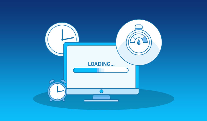
When users visit a website, they expect it to load quickly. A sluggish website isn't just an annoyance; it can push visitors away. Think about it – how long would you wait for a page to load? Probably not long!
Every second counts in web design. Keep it swift and keep your users happy!
Navigating a website should feel natural and straightforward for users. Think of it as guiding your guests through your home; you'd want them to find the bathroom or kitchen easily, right?
Your website's navigation can guide users to the information they seek, or it can drive them away. Prioritize clarity and accessibility to keep them engaged and satisfied.
One of the foundational principles behind captivating web design is visual hierarchy. It's the art of arranging content in a manner that effortlessly guides visitors through the information. Properly employed, it makes sure your website looks good and is a breeze to navigate.
It's more than just placing things where they seem fit. It's about purposefully positioning design elements so users are naturally drawn to the most important parts first. Think of it as a roadmap for eyes. Use contrasting colors, different-sized texts, and strategic placements to dictate where a viewer's attention should go.
Crafting strategic layouts means understanding what you want your users to see first, second, third, and so on. Lay out your content in a way that logically and visually flows, making sure users don't miss out on any important stuff. Web design isn't just about looking good; it's about serving up content in an order that makes sense.
Great web design is less about flashy graphics and more about creating a user-friendly experience. The easier you make it for visitors to find what they're looking for, the better your website will perform.
Checkout Domain Driven Design for Microservices: Complete Guide
Grid-based layouts are the secret sauce to a neat and structured website design. Imagine organizing your content like you're setting items on a chessboard, where every piece has its own space, and there's no overlapping chaos.
Order and Cleanliness: Grids help you place every design component where it belongs. It's all about straight lines and equal spacing. The result? A website that's both easy on the eyes and simple to navigate.
Boosting User Understanding: Readers can easily follow and absorb information when it's laid out systematically. It feels familiar, even if it's their first visit.
So, when designing, always think about the grid. It's the foundation that can guide a reader through your site effortlessly. After all, a well-organized space is always more inviting.
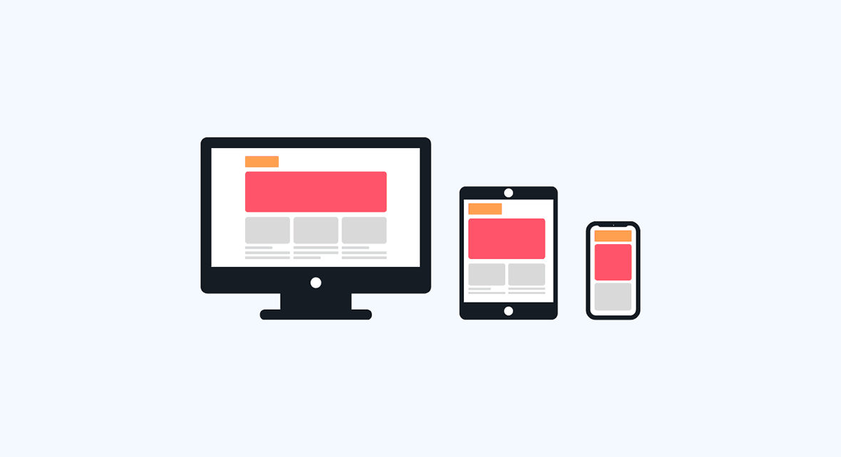
In the vast expanse of web design, one key principle stands out: adaptability. In today's diverse device environment, it's crucial that websites adapt to fit any screen size. This is where fluid design comes into play.
By focusing on adaptability, you can ensure that your website looks its best on every device, from smartphones to desktops. Stick to these principles, and you'll be on the right path to creating a site that truly works for everyone.
Wrapping up, the core of a great website lies in its design principles. These rules ensure a pleasant user experience and hold the key to a site's success. A simple, clear, and consistent design keeps users engaged and helps convey your message effectively. Prioritizing a mobile-first approach and focusing on speedy load times are just as crucial. Remember, it's all about the user.
With the rapid changes in design trends and user expectations, staying updated is no longer a choice but a necessity. Commit to continuous learning and stay in touch with the pulse of web design.
If you're looking to craft a site that checks all these boxes, we at SayOneTech are here to help. Our team prides itself on designing user-centric web applications that stand out, aligning with all the top-notch web design principles. Ready to take the leap? Let's build something amazing together.
We're committed to your privacy. SayOne uses the information you provide to us to contact you about our relevant content, products, and services. check out our privacy policy.


We collaborate with visionary leaders on projects that focus on quality